Tuesday, May 02, 2006

book designs


design: Base Design
Publisher: FAD
Year: 2001
Country: Spain

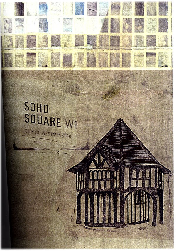
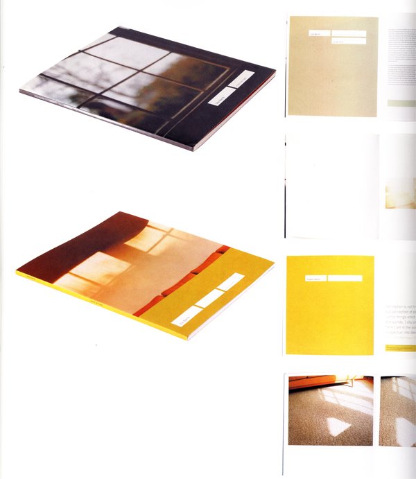
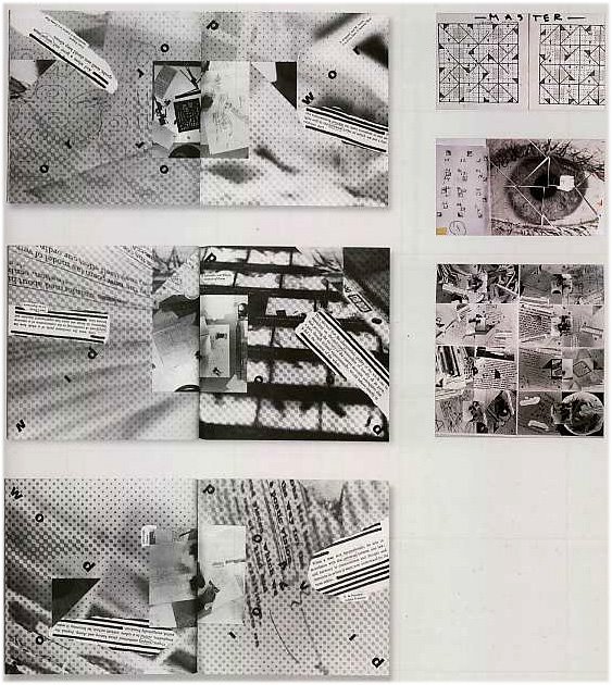
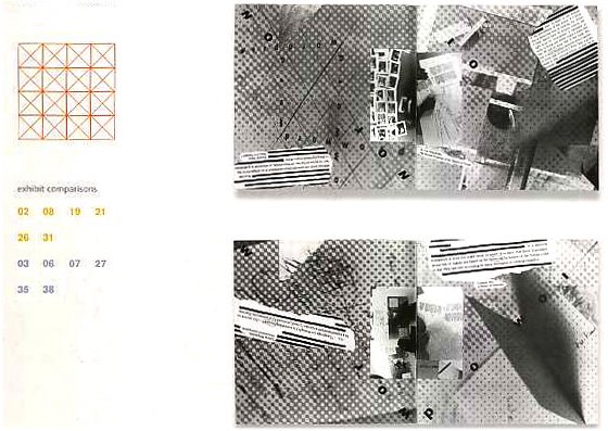
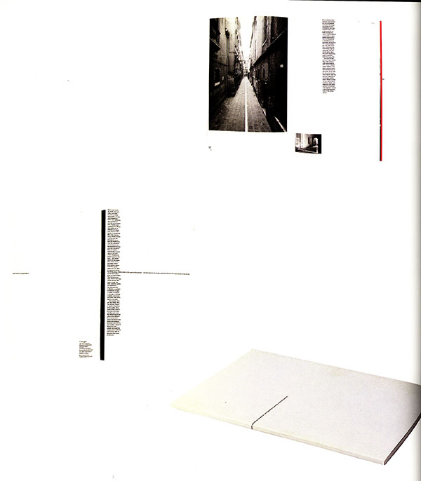
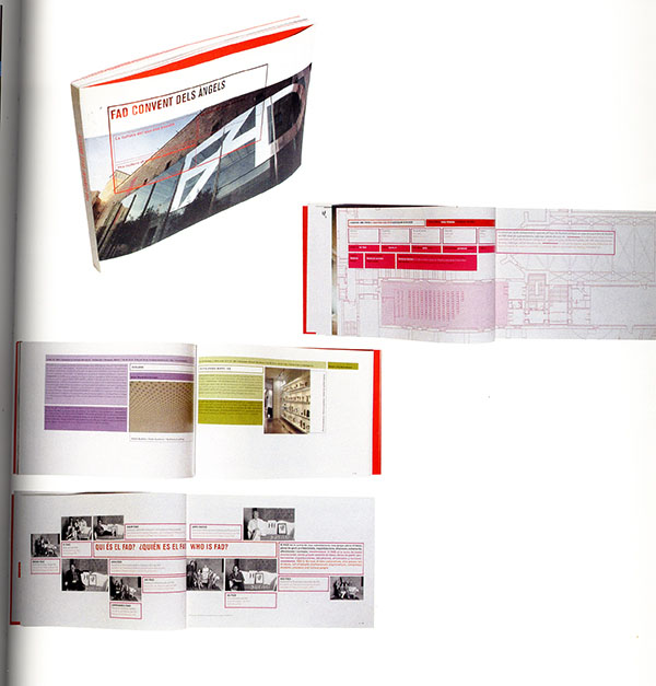
Making the most of its wide panoramic format, the book places text and images in various-sized boxes on a complex interlocking grid system. the latter evokes the architectural qualities of the building the book is about, as is visible in the front-cover image of its facade.

Design: A.G. Fronzoni, Christian Aichner & Bernd Kuchenbeiser
Project: A.G. Fronzoni
Year:1998
Country: Italy/Switzerland

Reflecting the lightness of touch of Italian designer A.G. Fronzoni, this simple little book dispenses with a title or any other clue as to its contents on the outside. Instead, a single line of text wraps itself around the cover, beginning on the inside back flap and ending: "words left unspoken, unrequited love, giving, to become, to become poorer-'. Inside, the book further echoes the style of the designer with its use of narrow columns of text, giving a fluid, vertical dynamic to the page. All typography is set in 6pt Univers bold; the foliosare in Univers light.

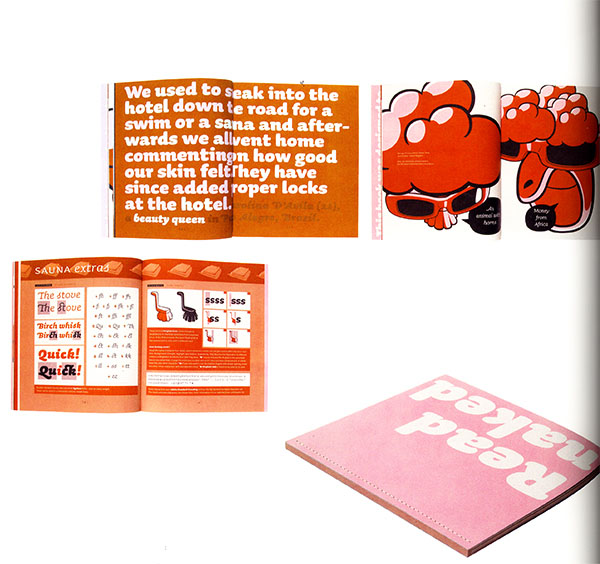
Design: Piet Schreuders & Underware
Project: Read Naked
Year:2002
Country: Holland

Specially produced to withstand saunas, this book is resistant to hot steam up to 120˚F. Indeed, some elements are only visible when viewed inside a sauna at 80˚F and above. The book gives guidlines on drying the book out after use; methods include baking, Microwaving and drip-drying on a clothesline.
Produced to promote a new typeface called Sauna, the whole book has a strange, plasticized quality owing to the heat treatment. The pages are bound together by stitching that passes from front to back. Again, the binding method is resistent to extreme heat and humidity.

Tuesday, April 25, 2006

magCulture >new magazine culture > Jeremy Leslie


Am7( Germany, Issue 1, Summer 2002)
A choice of covers : the front cover and back cover of this magazine about communication give very different levels of legibility.I really like the photography in this issue. The use of white space, asymmetry, and sans serif appeals to me quite a bit. The placement of secondary information in the margins and a small point size at that to be tasty. And the graphics on the back In Arabic is astrong contrast from the front photo.

Taxi (UK, Issue1 Summer 2002)
Published internationally by the Gettyimages picture library as an editorialized image catalogue, this magazine not only relegates its name to the bottomof the cover, but uses different hand- wriiten versions of the name for different issues. This first issue included an appeal to readers to send in their versionof the name in their handwriting.

Hot Rod (Norway)
This Microzine is published in Oslo and is the personal project of its publisher/editor/designer. The Baroque logo design on the top two examples gives nothing away about the content: the bottom example doesn't even include the logo. I really find the the ornamental typefaces interestnig I guess its the intricate detail. The transparent layer of the title Hot Rod overlayed on photography, I really like.

Coupe (Canada)
This uses the magazine format to take a close look at the ' wonders of the modern electronic age'. It does so through busy collages of text and image, following none of the rules of the magazine design. Rules are avoided on these covers too: all that links them together is the page size.Issue 5 features the magazine's name in spot varnish only, which is invisible in this reproduction. What I find really interesting about this is the experimentation that is taking place, it lends itself to unexpected results that captivate the viewer.

Tuesday, April 18, 2006

mags & book designs


Mirko Borsche {art director}
Jetzt magazine

Jetz means "Now" was published every Monday with the newspaper in Germany. It was attempt to attract younger readers to buy the newspaper—teenagers and people in their twenties.
The design team only made up of two people Mirko and Sandra Eichler.
The content was just about normal people; their problems, music, apartments, love and politics…all the things that concern them. They tried to awaken the creativity of the reader, for example, by using text to make illustrations so that the reader was able to make his own picture. One of the stories they ran was about 15-year olds who injure themselves with knives and needles. To illustrate this they photographed close-up shots of skin and then wounded the pictures with knives. By doing this the reader didn't see actual wounds but saw the pain.

Mirko was asked some questions as well, I thought it would be imteresting to let you know what his responses were:
How did your design develop during your time at the magazine?
Mirko : { It developed weekly. It's very hard to be creative every week, but once you start working your design starts to grow every day. }

M-real { International, Issue 4, Winter 2001 }

Themed 'Response', this magazine was designed to a simple grid with all images in place. The pages were then passed to the illustrator who "responded' to the content, drawing and doodling over each page on the tracing paper. the two elements were then combined at repro stage to make it look like a reader had been through the whole magazine defacing it.

Design: Bruce Mau Design
Project: S,M,L,XL

This book has inspired many equally weighty imitators . Conceived by architect Rem Koolhaas and designer Bruce Mau, it is divided into the four sections suggested by the title: small-i.e. private commissions by Koolhaas:medium-i.e. commercial developments large-i.e. office blocks:and extra large-i.e. office blocks; and extra large-i.e. urban infrastructures. Far from being a conventional architectural monograph, the book generously gives Koolhaas space to air his thoughts, ideas and influences. Printed with specials, fluorescents and metallic inks,the book constantlychanges pace and style.

Tuesday, April 11, 2006

magCulture: {new magazine culture} Jeremy Leslie


Tme Out: { UK, Issue 1595, March 14-21 2001 }
At first glance, it looks like the butcher's knife has cut some fresh, bloody meat: closer look reveals it has cut some tomatoes; a visual trick that neatly introduces the subject of vegetarianism while not excluding carnivores. When I first saw this I didn't notice that it was tomatoes that are being chopped I thought that it was pieces of cows but through further inspection and reading it was not the case. By the way I thought Lee would find this pretty humerous, being that he is a vegetarian. Also I like how it brings across vegetarianism and canivories at the same time. Bring two ideas together in one concept is pretty amazing.

BEpeople { Belgium, Issue 2, February/March/April 2002 }
Each issue of this magazine about Belgium features a person obliterated by a title in white circle, rendering the individual irrelevent and emphasizing the generic nature of its name. I really find the taking away of information hence the cut out circle appeals to me. White space allows for the heading primary information and the juxapostion of imagery as well.

No.A/B/C... ( Belgium, issue A, Summer 2001 )
Each issue of this fashion magazine is titled a single letter and overseen by a different editor, in this Dirk Van Saene. The issue has no cover: instead it starts with the contents page and is wrapped in plastic printed with its title, 'A'. The packaging is the cover of the magazine and that's what I find really interests me. Breaking from the norm that is the traditional sense of navigation and assumption is what this does.

Thursday, April 06, 2006

{contemporary illustrations}


Michelle Thompson {sky montage}

After completing a bachelors of arts degree in graphic design at Norwich School of Art & Design, British illustrator Michelle Thompson continued her studies in London, graduating with a master of arts degree from the Royal College of the art in 1997. She has since worked on projects encompassing advertising, publishing and design. She uses letterpress, a camera, scanner and computer to create her immaculately crafted illustrations, and describes her style as "digital and hand-made collage".

Mode 2 {illustrations}

"I describe myself as a painter and illustrator, "explains mode 2. " It sounds like a craft as opposed too something arty." Born in Martritus , MOde 2 is now based predominantly in paris. Self taught, he uses pencil, acrylic paint and, increasingly, a mac to create illustrations that are beautifully crafted to the tinest detail initially influenced by comics of the late seventies and earily eighties' his artwork has also drawn inspiration from hip hop music and graffiti writing.

Christine Berrie {Soho square W1}

" Computers have enabled us to explore new processes and new ways of making pictures," comments scottish image maker Christine Berrie . "But I think the most interesting work originates from hand-crafted imagery. It is refreshing, at the moment, to see more hand crafted images . I hope this will always be the case."

Saturday, March 18, 2006

new book design


design: Andreas Laeufer
project: Mined
To open is to destroy. The cover is nothing more than shrinkwrapped polythene - the yellow block on the front is in the fact stuckon to the plastic. The book does not seek to hide the industrial techniques in its production; the binding is raw and exposed. The pages have not been trimmed down which means would- viewers require a lot of commitment. Not only do they have to rip off the cover, they then have to tear the pages to see the content. Sandwiched in the middle of the thick volume are 'tools for life' -a pair of scissors and some thread. Are they there to assist with the healing necessary after the many acts of destruction the reader must carry out to access the book itself?

design: Aboud Sodano (case:Jonathan Ive)
project: You Can Find Inspiration in Everything
Expanded polystyrene is used as the outer packaging for this book about the British fashion designer Paul Smith. The form echoes that of a large leather-bound volume. The packaging provides more than just protection for the book during shipping; it becomes a kind of dust jacket that is both disposable and cherishable. Inside this custom case, the polystyrene structure carefully holds in place the book itself, which comes in a variety of cloth covers, all cut froma selectionof the designer's textiles. In fact, owing to the varying crops of the different clothes, eachcover is unique. The buyer has no idea what his or her cover will loke like until the protective case has been cracked open.
The casing also houses a Paul Smith branded magnifying glass, partially as a visual pun on the title of the book: 'You Can Find Inspiration in Everything' - And If You Can't, Look Again!'

design: Michael Worthington
project: Uta Barth: Nowhere Near & Uta Barth:..And in Time
These two books, produced in 1999 and 2000, show the work of the photographer Uta Barth. The same design scheme has been used in both. This set the often bleached-out images in large areas of text-free white space. Both volumes have essays at the back; these are set using a palette of muted, pale colours that reflect the hue of the photography.

design: Michael Worthington
project: Uta Barth: In Between Places
Containing essays, gallery views and full-page images, this book has a variety of paces. Full-bleed images continue on preceding and following pages, contrasting with much smaller reproductions which are given ample space in which to breath.

Monday, March 13, 2006

Restart: New systems in Graphic Design


{ Colorface colour font, 1999 }

{ Joshua Berger argues that language ' is anything that communicates information'. }
Type is no longer merely the letters and punctuatiion marks that form words, sentences and paragraphs, but 'the building blocks of meaning in whatever form that meaning arises. Type can be image. Type can be sound. Type can be a color. When you adopt this view and immediately you are faced with a world that is entirely typographic, everything around you becomes part of a vocabulary. Made by randomly selecting colours (or notes) that are matched to letters, the fonts lend itself to colourful (or noisy) renditions of texts. Despite being called fonts they are not typefaces, but alphabetic codes: the typeface is not read it is decoded by the viewer.While Berger's colour font may not be your typical strict typographic font, it raises pertinent questions about the nature of typographic meaning.

{ Speech recognizing letterforms, 1999 }

Andreas Lauhoff has taken type's muteness and has attempted to give it a human voice, using a system whereby patterns of speech can be conveyed by letterforms. He made a speech-waveform image of recorded spoken words, dividing the waveforms into small sections that correspond to the enuciation of each letter. The letterforms, made from a transparent material that renders their structure ever-apparent, ooze elegent, pseudo-scientific restraint. Lauoff has demonstrated the system's potential by transcribing a section of Stanley Kubrick's 1968 film 2001 - Space Odyssey. Addressing the computer "Hal" several times, David Bowman's tone becomes increasingly demanding and, as a result, Lauhoff's extruded letterforms raise in pitch and become larger and jagged.

Sunday, March 05, 2006

more flash sites of interest


http://neovision.jp/

This flash site employes a mosaic structure {grid} for displaying images for purchase that moves horizontally at various speeds. Once you chose the image you can grab and drag it to the bottom of the screen to buy. You can control the navigation speed of the pictures, color of the background and view of the pictures from mosaic or normal, also you can employ keywords to navigate to a specific image of interest. There is also a catalogue option window to navigate more images that are included in the catalogues. I really find this navigation very appealing because it allows you to view the photo's all juxtaposed together in a grid that reveals itself little by little.

http://www.muzyczny.org/

The structure of this flash site is very close in comparison to a slot machine. A slot machine structure is pretty interesting to use in juxtaposing the images and the transition from one set of information to another. Each transition of information and imagery is colored with either red or blue or both. The imagery I have noticed is halftone screen that compliments the two colors used.

http://www.crew11.net/

The use of macro & micro is employed to show the products {which is these little characters in boxes}. By clicking on each individual character's box it is brought to the foreground to reveal itself and by clicking again it flips to the back of the packaging to inform the consumer of the contents. I really like the identities of the characters and the packaging because they each communicate in their own way.

Sunday, February 26, 2006

flashsites of interest


I like this flashsite because it really tries to experiments with the conventions of website navigation. The news paper is the container for its information, the user navigates its content by mouse {clicking and scrolling}. After you get to the destination specified, a pen animation circles the heading of the location. Its a coincidence that the posters that I am designing have a lot in common with this flashsite, whereas both deal with new media and old media and how it communicating to its audiences through its use digitally and traditionally. It is also pretty interesting that the buttons for the photography is in the content of the photographed newspaper.

http://www.conceptm.nl/

This site is very clean and professional, whereas the use of white space is designed in a modern form that follows the function of it. The photos are displayed in sequential fashion but have subtle thing that goes on with the photo that entails a screen that disappears with ever consecutive photo shown. I really like navigating the photos, because the space that the information occupies changes in different ways and which keeps it dynamic. Structure plays a interesting part with the axis lines that are created with the characters and are used to organize and group the information that one navigates. This flash-site makes me want to learn Japanese so I can understand its valuable content.

http://www.shiroganeya.co.jp/

Saturday, February 18, 2006

Modular grid deconstruction via chance operation


It may seem like it is a random three- dimensional effect with spaces, texts, and images but it is built on a master grid that contributes to its intuitive organic quality. This project was completed for a exhibit entitled "Universal/Unique." The focus of the exhibit was the relationship between structure and freedom in design and the exhibitors were asked to submit work using predetermined kernel elements in mind: grid, the word "word", and the image of an eye. A modular grid within a square format was set up by the designer using the horizontal, vertical, and isometric (45˚) axes, and then systematized to each of the kernel elements, plus excerpts from the design process like essays, photographs that would interact with the grid as well. The master eye grid directs the segments' placement from page to page, by employing a triangular dissection based on this master grid. On one side of the spread the excerpted texts, all refer to the idea of universality, which come into juxtaposition with the opposing concept of uniqueness when the pages are cut and folded together.

Because of its structure, the grid forces the deconstruction, the material ends up doing whatever it will because it is made to conform to the predetermined criteria. Upon closer inspection, the result is a college of texture, shadow, light and type that reveals a hidden order.

Chance operation and deconstruction is a interesting methodology to employ to you projects to get unpredicted results. These unpredicted outcomes should be a result of a predetermined methods. Predetermined methods being the systemization of the elements used and formated within a structure.

Saturday, February 11, 2006

modular grid deconstruction, project: {recycled calender}


This calendar addresses the issues of construction, deconstruction, waste and creation, this inventively produced calendar is printed on recycled printed matter. Each month's calendar matrix pushes and pulls at the under lying grid structure that contains the days and weeks. In some cases, the intervals between the modules are expanded and contracted. The secondary logic, is produced with a superimposed grid of geometric shapes that interacts with the typography, alternately building shapes around it and obscuring it with invisible forms. Each individual months and their deconstructions gain added meaning in the context of the printed preexisted image underneath that has been appropriated.

This calendar is a example of what can be done when remixing and appropriating images from different sources. These preexisted images adds a layer of information that reveals a process in the making. I feel in this case that most any appropriated image would work because of the conception of recycled paper and the theme of the calendar being things that are recycled. I think this application of appropriated imaging can be brought over to about any concept you see fit. Another thing I would like to add is that this process yields unexpected results because images are found, and it allows a chance operation to take place.

Sunday, February 05, 2006

Michael Worthington {true experimentation} p.115 Radical Type Design


Michael Worthington is a experimental with is work in design.He believes that true experimentation is about taking risks and I agree with him on that assumption that you have to be inquisitive, believing that you can create something that does not already exist, being willing to make mistakes, take those mistakes as learning experiences that can move you into a process that allows you to create something unfamiliar. Their should be no expectations what form should in be in the experimentation of the form. I think that should be applied in design in general because if not you allow yourself to create a form that probably been seen before or even worse cliche.

Poster {2001-02}, based on The Jam's "That's Entertainment', from a series of typographic landscapes' by Worthington

Its pretty interesting how the type forms a gestalt with typography. I like how he visually interprets the sounds and translates it to the hierarchy of the type. By this I mean if you look at A POLICE CAR and A SCREAMING SIREN it really communicates what it says visually. The play on hierarchy with the typography is rhythmical, in that in seems to escalate and diminish in pitch corresponding to the action that is occurring. Sound waves manifest themselves through visual communication in this piece.

The Smiths' Reel Around the Fountain' the other piece

The layering of typography and the transparency of the type is very appealing to me. The asymmetrical composition is more interesting to me because its not centered and its not symmetrical, I find that the more interesting designs are asymmetrical. His understanding hierarchy is apparent in his use of typography, and it has a very strong dynamic feel compositionally. This dynamic is shown through the primary information because it seems to cut wright into the secondary information and overlay it at the same time. And it tends to become almost illegible and complex where the information merges together by the layering of the transparencies of type.

Monday, January 30, 2006

mapping meaning and definning spaces


Fuse 14: Cyber (1995)
A berlin based group developed a really interesting typeface that challenges readability and a attempt to bring emotion into the medium of cyberspace. It's like a coded message that can only deciphered if you really take the time and analyze it. What I found interesting about the reading was main aim of semantic typography is to arrange the structure of the text visually and to bring forth meaning. As a mediator of messages the graphic designer or typographer must recognize the the " layers of meaning" this plays a vital role in the dissemination of the information. A additional layer of meaning can be explored other than literal meaning, recognition through cultural contexts through the alphabetic forms not just through the word.

alphabet (1992) for Fuse
What was very intriguing and experimental about this typeface was that it employed the human body as a physical 'sign', and taking into account gestures and expressions to give the reader clues for the letter they represent. Wow, a alternative to the visual grammar that we are so accustomed to seeing. Alphabets are supposed to read and at the same time a set of individual photos expressing a second linguistic narrative based on the sitter's cultural and social identity through the clothes they wear.

Sunday, January 22, 2006

p.72-73 thinking with type & Evidence {artist, Candy Jernigan}


Katherine Mccoy {graphic designer} imploded the traditional dichotomy between seeing and reading.Her approach challenged readers to produce their on meaning which elevated the status of the designer with in the authorship.The words can be preceived as icons, forms, patterns through the use of ambiguity and complexity. She developed a model of typography as a discourse in which the designer and the reader actively interpret an author's text.

Evidence: artist {Candy Jernigan}

This book evidence is the most interesting book I have seen on the subject of collecting and documentation of ephmera and found objects. Candy Jernigan decided to make a book when she traveled to europe that would contain any and all physical "proof" that she had been their : ticket stubs, postcards, restaurant receipts, airplane and bus and railroad ephemera. On successive trips, these collections grew to include food smears, hotel keys, found litter, local news, pop tops, rocks, weather notations, leaves, bags of dirt- anything that would add information about a moment or a place, so that the viewer could make a new picture of the remnants. For Candy objects emerged as "icons" for particular cities and these objects became the material for the book.

One of the many documentations of ephmera in this book I find especially interesting is "Blood of a Vagrant" in the section of urban evidence. In Blood of a Vagrant she writes: "An unknown man, apparently the victim of a knife attack, collapsed on the sidewalk where he lay motionless until an ambulance took him, in a greatly weakened and in fact unconscious state, to a nearby hospital. The voluminous quantity of blood that he left behind gradually seeped into the sidewalk and was further diminished , two or three days later, by an earily morning rain." Blood of a Vagrant moves me because I sense Candy's identification with the victim, I feel the shock of how easily life can slip away, and how the last tangible evidence of life which was a pool of blood can just slowly vanish into nothing. I really enjoy her use of diagrammatic dotted-line signaling where the ambulance came and left and also the hand written information oppose to a font.

Sunday, January 15, 2006

Ideas on 72dpi, & weblinks

72dpi is all about taking risks, this book is available in the Hamilton library.

Task of designers is a professional bridging of the gap between self expression ( the artist ) and the problem-solving (the engineer). Design is about understanding and using form and content, not the debate about them.

Good design is also a question of inspiration and courage. The contributing factors for new concepts are created from chance, play, an evening out clubbing, music, film, love, sex, daydreaming together with experience, sampling and the constant exchange with friends checking, weaving further.

The methods which have extraordinarily offensive creative potential are chaos, coincidence, deconstruction, storytelling.
You have to consider when designing for the net the demands for new methods for storytelling. These are now being added by the parameter of interaction. The symbiosis between information and emotion is storytelling. We are also transporting visual and emotional knowledge alongside with the facts. If we are telling a story by digital means then, we have to consider all the media at our disposal, such as video, typography, sound, animation and graphics.

"Inspiration comes from everything. The problem is not where to obtain it, but where not to." (Eddie Pak)

How do signals become information and how does information become knowledge?
A example of this is train schedules which usually consist of a disordered databank including train numbers, connections, departures and arrival times and special service offers. Once this data is structured it turns into information, in other words when its disordered state is transferred into a ordered state. Then the interpreter receives this information who understands the meaning of the train connections and draws his or her on conclusions. If the data does not make sense then it can not be assimulated. Information turns into knowledge when that information is internalized by the interpreter, which is then turned into knowledge that can be acted on. This phenonmenon bound to individuals (brains as knowledge depots) is commonly understood as knowledge.

"Knowledge is a dynamic mixture of structure experiences , values, context information and expert insight that provides a framework for evaluating and incorporating new experiences and information."

{some websites I found interesting that push the envelope}
www.volumeone.com
www.thekohlheart.com
www.nitrada.com
www.2ndrec.com
www.lineto.com