Tuesday, April 25, 2006

magCulture >new magazine culture > Jeremy Leslie


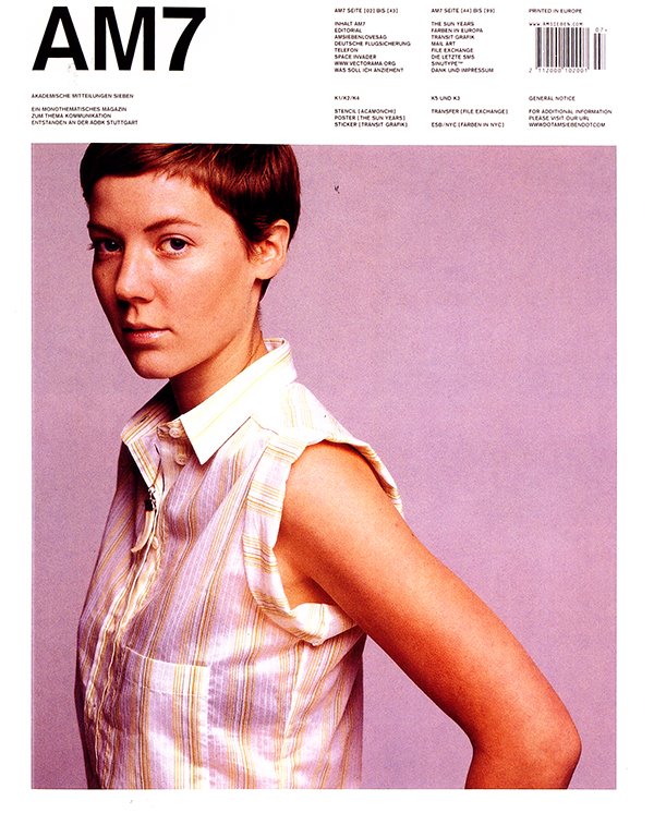
Am7( Germany, Issue 1, Summer 2002)
A choice of covers : the front cover and back cover of this magazine about communication give very different levels of legibility.I really like the photography in this issue. The use of white space, asymmetry, and sans serif appeals to me quite a bit. The placement of secondary information in the margins and a small point size at that to be tasty. And the graphics on the back In Arabic is astrong contrast from the front photo.

Taxi (UK, Issue1 Summer 2002)
Published internationally by the Gettyimages picture library as an editorialized image catalogue, this magazine not only relegates its name to the bottomof the cover, but uses different hand- wriiten versions of the name for different issues. This first issue included an appeal to readers to send in their versionof the name in their handwriting.
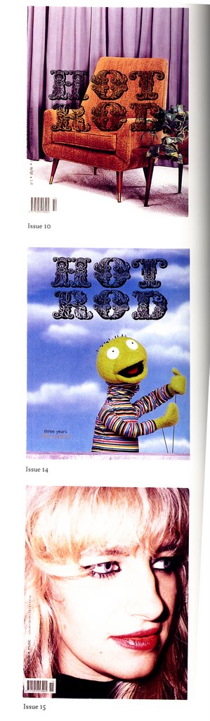
Hot Rod (Norway)
This Microzine is published in Oslo and is the personal project of its publisher/editor/designer. The Baroque logo design on the top two examples gives nothing away about the content: the bottom example doesn't even include the logo. I really find the the ornamental typefaces interestnig I guess its the intricate detail. The transparent layer of the title Hot Rod overlayed on photography, I really like.
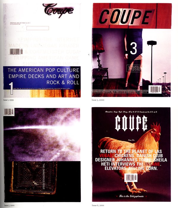
Coupe (Canada)
This uses the magazine format to take a close look at the ' wonders of the modern electronic age'. It does so through busy collages of text and image, following none of the rules of the magazine design. Rules are avoided on these covers too: all that links them together is the page size.Issue 5 features the magazine's name in spot varnish only, which is invisible in this reproduction. What I find really interesting about this is the experimentation that is taking place, it lends itself to unexpected results that captivate the viewer.

Tuesday, April 18, 2006

mags & book designs


Mirko Borsche {art director}
Jetzt magazine

Jetz means "Now" was published every Monday with the newspaper in Germany. It was attempt to attract younger readers to buy the newspaper—teenagers and people in their twenties.
The design team only made up of two people Mirko and Sandra Eichler.
The content was just about normal people; their problems, music, apartments, love and politics…all the things that concern them. They tried to awaken the creativity of the reader, for example, by using text to make illustrations so that the reader was able to make his own picture. One of the stories they ran was about 15-year olds who injure themselves with knives and needles. To illustrate this they photographed close-up shots of skin and then wounded the pictures with knives. By doing this the reader didn't see actual wounds but saw the pain.

Mirko was asked some questions as well, I thought it would be imteresting to let you know what his responses were:
How did your design develop during your time at the magazine?
Mirko : { It developed weekly. It's very hard to be creative every week, but once you start working your design starts to grow every day. }

M-real { International, Issue 4, Winter 2001 }

Themed 'Response', this magazine was designed to a simple grid with all images in place. The pages were then passed to the illustrator who "responded' to the content, drawing and doodling over each page on the tracing paper. the two elements were then combined at repro stage to make it look like a reader had been through the whole magazine defacing it.

Design: Bruce Mau Design
Project: S,M,L,XL

This book has inspired many equally weighty imitators . Conceived by architect Rem Koolhaas and designer Bruce Mau, it is divided into the four sections suggested by the title: small-i.e. private commissions by Koolhaas:medium-i.e. commercial developments large-i.e. office blocks:and extra large-i.e. office blocks; and extra large-i.e. urban infrastructures. Far from being a conventional architectural monograph, the book generously gives Koolhaas space to air his thoughts, ideas and influences. Printed with specials, fluorescents and metallic inks,the book constantlychanges pace and style.

Tuesday, April 11, 2006

magCulture: {new magazine culture} Jeremy Leslie


Tme Out: { UK, Issue 1595, March 14-21 2001 }
At first glance, it looks like the butcher's knife has cut some fresh, bloody meat: closer look reveals it has cut some tomatoes; a visual trick that neatly introduces the subject of vegetarianism while not excluding carnivores. When I first saw this I didn't notice that it was tomatoes that are being chopped I thought that it was pieces of cows but through further inspection and reading it was not the case. By the way I thought Lee would find this pretty humerous, being that he is a vegetarian. Also I like how it brings across vegetarianism and canivories at the same time. Bring two ideas together in one concept is pretty amazing.

BEpeople { Belgium, Issue 2, February/March/April 2002 }
Each issue of this magazine about Belgium features a person obliterated by a title in white circle, rendering the individual irrelevent and emphasizing the generic nature of its name. I really find the taking away of information hence the cut out circle appeals to me. White space allows for the heading primary information and the juxapostion of imagery as well.

No.A/B/C... ( Belgium, issue A, Summer 2001 )
Each issue of this fashion magazine is titled a single letter and overseen by a different editor, in this Dirk Van Saene. The issue has no cover: instead it starts with the contents page and is wrapped in plastic printed with its title, 'A'. The packaging is the cover of the magazine and that's what I find really interests me. Breaking from the norm that is the traditional sense of navigation and assumption is what this does.

Thursday, April 06, 2006

{contemporary illustrations}


Michelle Thompson {sky montage}

After completing a bachelors of arts degree in graphic design at Norwich School of Art & Design, British illustrator Michelle Thompson continued her studies in London, graduating with a master of arts degree from the Royal College of the art in 1997. She has since worked on projects encompassing advertising, publishing and design. She uses letterpress, a camera, scanner and computer to create her immaculately crafted illustrations, and describes her style as "digital and hand-made collage".

Mode 2 {illustrations}

"I describe myself as a painter and illustrator, "explains mode 2. " It sounds like a craft as opposed too something arty." Born in Martritus , MOde 2 is now based predominantly in paris. Self taught, he uses pencil, acrylic paint and, increasingly, a mac to create illustrations that are beautifully crafted to the tinest detail initially influenced by comics of the late seventies and earily eighties' his artwork has also drawn inspiration from hip hop music and graffiti writing.

Christine Berrie {Soho square W1}

" Computers have enabled us to explore new processes and new ways of making pictures," comments scottish image maker Christine Berrie . "But I think the most interesting work originates from hand-crafted imagery. It is refreshing, at the moment, to see more hand crafted images . I hope this will always be the case."