

Mirko Borsche {art director}
Jetzt magazine
Jetz means "Now" was published every Monday with the newspaper in Germany. It was attempt to attract younger readers to buy the newspaper—teenagers and people in their twenties.
The design team only made up of two people Mirko and Sandra Eichler.
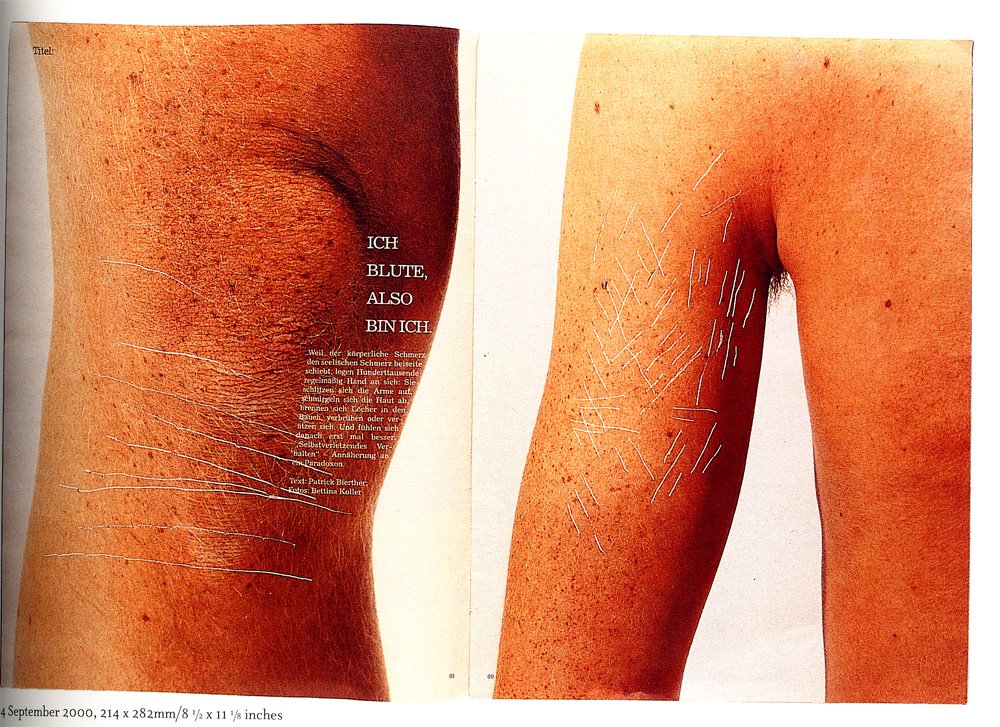
The content was just about normal people; their problems, music, apartments, love and politics…all the things that concern them. They tried to awaken the creativity of the reader, for example, by using text to make illustrations so that the reader was able to make his own picture. One of the stories they ran was about 15-year olds who injure themselves with knives and needles. To illustrate this they photographed close-up shots of skin and then wounded the pictures with knives. By doing this the reader didn't see actual wounds but saw the pain.
Mirko was asked some questions as well, I thought it would be imteresting to let you know what his responses were:
How did your design develop during your time at the magazine?
Mirko : { It developed weekly. It's very hard to be creative every week, but once you start working your design starts to grow every day. }
M-real { International, Issue 4, Winter 2001 }
Themed 'Response', this magazine was designed to a simple grid with all images in place. The pages were then passed to the illustrator who "responded' to the content, drawing and doodling over each page on the tracing paper. the two elements were then combined at repro stage to make it look like a reader had been through the whole magazine defacing it.
Design: Bruce Mau Design
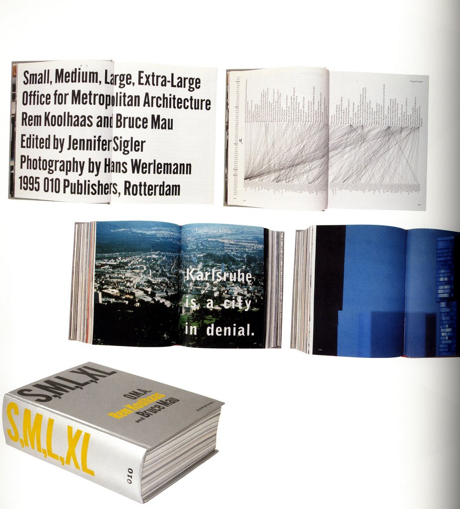
Project: S,M,L,XL
This book has inspired many equally weighty imitators . Conceived by architect Rem Koolhaas and designer Bruce Mau, it is divided into the four sections suggested by the title: small-i.e. private commissions by Koolhaas:medium-i.e. commercial developments large-i.e. office blocks:and extra large-i.e. office blocks; and extra large-i.e. urban infrastructures. Far from being a conventional architectural monograph, the book generously gives Koolhaas space to air his thoughts, ideas and influences. Printed with specials, fluorescents and metallic inks,the book constantlychanges pace and style.
1 comment:
the jetz magazine was a clever way to get a younger audience's attention. I really like the computer graphics combined with the hand drawn images and the handwriting. I also thought that the typography in the first and second magazine spreads was very simple, yet nicely done. In the second magazine spread, the one with the boy and girl in bed, the type in simply going with the flow of the sheet, but i really like how it looks like the boy and girl are peeping up over the sheets.
Post a Comment